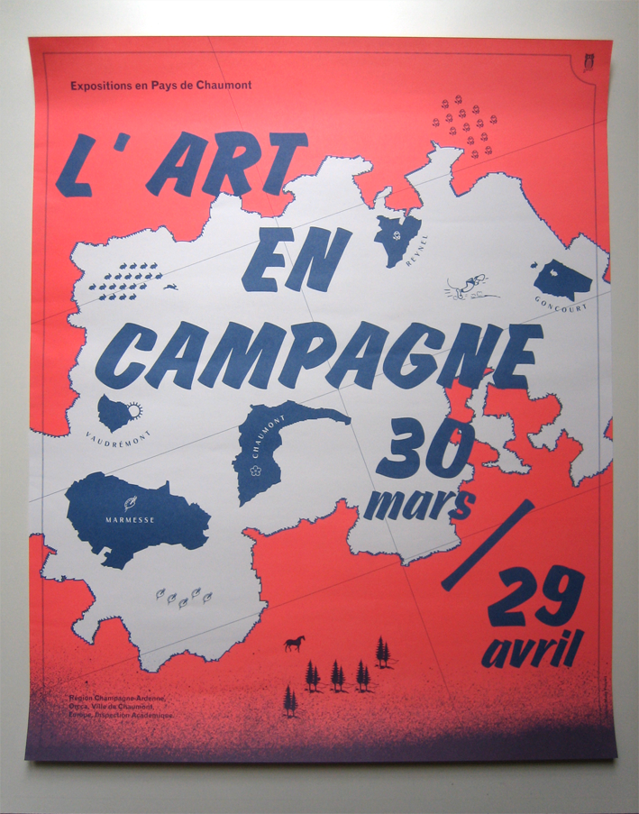
L’Art en campagne
— february 2012
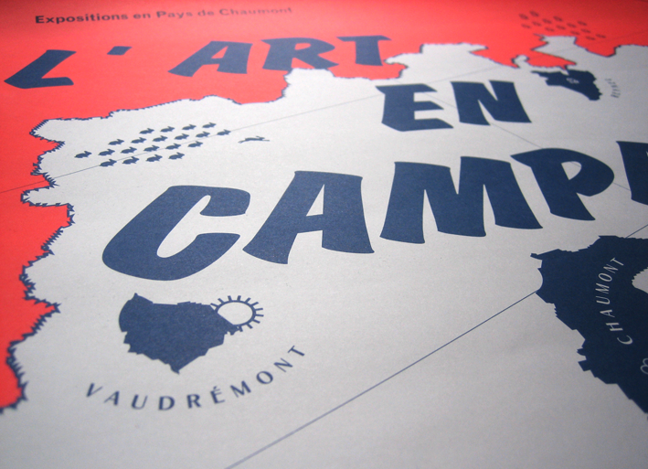
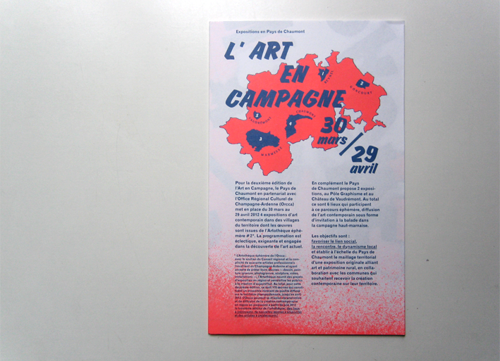
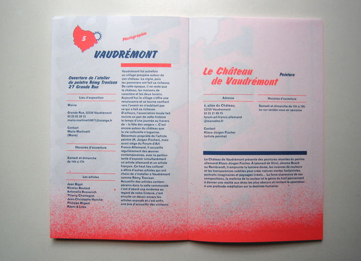
The proportions and the folding of the leaflet, as well as the repetition of pictograms to represent a municipality, are borrowed from to the visual system of the maps.
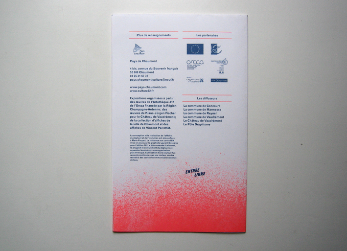
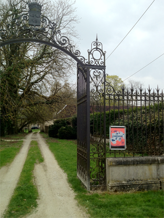
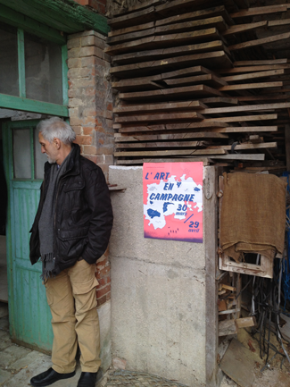
The use of a fluorescent color combined with a darker one, refeers to certain popular codes of communication. Merci à Étienne Hervy pour les prises de vues.
—
420 x 520 mm
210 x 130 mm